Friday, June 28, 2013
Wednesday, June 26, 2013
How to make a GIF using Picasion
1
 Choose the images
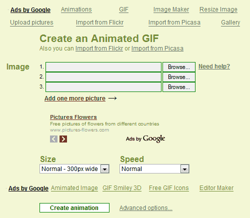
When you are on the home page of Picasion, the below image is what you will see. To begin, you should upload more than one image to create an animated GIF. You can choose to import the images from your own local files or from popular online photo sharing website such as Flickr or Picasa. Smaller-sized files are preferred to larger ones, as they are easier to manipulate and play around with.
NOTEYou can also alter the size and speed of the animated GIF. A higher speed GIF will switch the images more quickly. However, you do not want to make it too fast otherwise your eyes will hurt from it moving too quickly!
NOTEIf you require assistance and are unsure about how to use Picasion, there is a Help link on the right hand side of the column to guide you. Do not be scared to ask for help if you find it too daunting. The instructions found when you click on the Help icon are useful and easy to follow. Even those who are technologically inept are able to create a GIF easily with Picasion!
NOTE
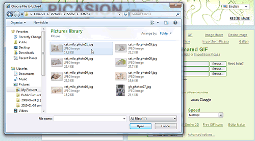 If you wish to import images from the computer that you are currently
using, you will need to click on the Browse button to choose the images
you want to use from your computer. A pop out box will appear as shown
in the image below.
If you wish to import images from the computer that you are currently
using, you will need to click on the Browse button to choose the images
you want to use from your computer. A pop out box will appear as shown
in the image below.NOTE If you are a Flickr or Picasa web album user, and wish to import images from there, there is a link provided at the Picasion home page. You can find this below the title, “Create an Animated GIF”.
2
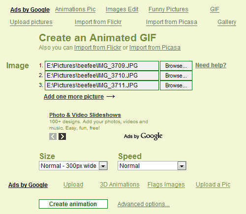 Click the button
Once you have chosen what files to upload and have determined the size and speed that you desire, click on the “Create Animation” button at the end of the column to proceed. As with email settings and many other file uploading systems, you can choose more than one file at a time. However, if you are new, you can choose 2 or 3 images so that you can get the hang of it. The reason for this will become clearer as we continue on with these steps.
3Done!
Once you have created the GIF animation, you will be directed to another page which will show the end result. It may take a while to create, depending on the images' file size. Small sized images tend to load faster, as mentioned in step 1. The reason for this is because the smaller the image size, the easier it is for your computer and the software to process the end result.
NOTEAt the bottom part of the page, there are options for you to either share it on famous online networking websites such as Facebook, MySpace, and Twitter. Also, HTML codes are provided to enable you to insert the animated GIF in your own personal website, blog, or in an online forum.
This is a basic copy and paste situation which you can use to show off what you have made so far. Of course, you can also test the end result first to see if you want to edit the pictures you are using, the speed, and so on.
How to Use Your Android Phone as a Portable Wi-Fi Hotspot

Just as you can use the iPhone as a Wi-Fi hotspot, many Android smartphones and tablets, starting with version 2.2 (Froyo) can be used as mobile hotspots
or portable Wi-Fi hotspots, letting you share your data connection on
your Android device wirelessly with up to 5 other devices, including
other cell phones, tablets, and computers. The Wi-Fi data sharing
feature is built into the Android devices.
This is more convenient than traditional tethering where you would share a data connection with a single computer using a USB cable or bluetooth, possibly with the help of software like PdaNet. Using the portable Wi-Fi hotspot feature, you don't need to have the app installed on your laptop or other devices and you get simultaneous Wi-Fi internet access for several devices. The downside, however, is that your carrier may charge a fee for the Wi-Fi hotspot feature (but most are charging extra for tethering too, so they're really the same thing).
Using your phone as a Wi-Fi hotspot is pretty simple; you just need to turn the feature on in your phone, and then the Wi-Fi signal will appear just like a regular wireless access point that your other devices can connect to. Here are the step-by-step instructions (they may vary a bit depending on your device, but the overall gist is the same).
Computerworld has posted a workaround to this Wi-Fi hotspot blocking: Use an Android widget app such as Extended Controls or Elixer 2, which toggle the Wi-Fi hotspot on or off on your homescreen so you can access the hotspot feature directly (without going through extra charges from your wireless provider). If that widget doesn't work for you, a free app called FoxFi does the same thing. Note that with other kinds of tethering, this is definitely a "do at your own risk" procedure.
That said, if you aren't restricted from using the Wi-Fi hotspot feature on your Android device, this is how to enable it and share your mobile data plan:
This is more convenient than traditional tethering where you would share a data connection with a single computer using a USB cable or bluetooth, possibly with the help of software like PdaNet. Using the portable Wi-Fi hotspot feature, you don't need to have the app installed on your laptop or other devices and you get simultaneous Wi-Fi internet access for several devices. The downside, however, is that your carrier may charge a fee for the Wi-Fi hotspot feature (but most are charging extra for tethering too, so they're really the same thing).
Using your phone as a Wi-Fi hotspot is pretty simple; you just need to turn the feature on in your phone, and then the Wi-Fi signal will appear just like a regular wireless access point that your other devices can connect to. Here are the step-by-step instructions (they may vary a bit depending on your device, but the overall gist is the same).
Updated: Workaround for Enabling Wi-Fi Hotspot for Free on Carrier-Restricted Plans
The instructions below are for the universal Wi-Fi hotspot feature found in Android, but even if you follow them you might not get internet access on your laptop or tablet after you connect. The reason is that some wireless carriers restrict the Wi-Fi Hotspot access to only those who are paying extra every month for Wi-Fi Hotspot access ($15-30 more a month on top of their mobile data plans).Computerworld has posted a workaround to this Wi-Fi hotspot blocking: Use an Android widget app such as Extended Controls or Elixer 2, which toggle the Wi-Fi hotspot on or off on your homescreen so you can access the hotspot feature directly (without going through extra charges from your wireless provider). If that widget doesn't work for you, a free app called FoxFi does the same thing. Note that with other kinds of tethering, this is definitely a "do at your own risk" procedure.
That said, if you aren't restricted from using the Wi-Fi hotspot feature on your Android device, this is how to enable it and share your mobile data plan:
Turn on the Portable Wi-Fi Hotspot on your Android smartphone (or tablet)
- Go to the Settings screen on your Android phone. You can get there by pressing the menu button on your device when you're on the home screen, then tapping "Settings".
- At the Settings screen, tap the "Wireless & networks" option.
- You should see an option for "Portable Wi-Fi hotspot". Click the
check mark beside it to turn on the hotspot and your phone will start
acting like a wireless access point. (You should see a message in the
notification bar when it's activated.)
- To adjust and check the settings for the hotspot, tap the aptly named "Portable Wi-Fi hotspot settings" option. You'll need to do this if you don't know the default password that will be created for your hotspot so you can make a note of it for connecting your other devices.
- You can change the default password, security level, router name (SSID), and also manage users connected wirelessly to your phone in the Wi-Fi hotspot settings.
Find and Connect to the New Wi-Fi Hotspot Created
- From each of the other devices you want to share Internet access with, find the Wi-Fi hotspot; this will probably be done automatically for you. (Your computer, tablet, and/or other smartphones most likely will notify you that there are new wireless networks to connect to. If not, on another Android phone, you'll find the wireless networks under Settings > Wireless & networks > Wi-Fi settings. See general Wi-Fi connection instructions for most computers.
- Finally, establish the connection by entering in the password you noted above.
Tips and Considerations
- Make sure you turn off the Wi-Fi hotspot feature when you no longer need shared Internet access from the other devices, since this can drain your cell phone's battery significantly.
- By default, the portable Wi-Fi hotspot will most likely be set up with WPA2 security and a generic password. If you're using this feature in a public place or concerned about hackers trying to intercept your data, it's best to change the password to something else before broadcasting your signal.
- Keep in mind again that your cell phone company might charge extra for this feature and/or have data restrictions on its usage, so make sure you check your plan or with your carrier for more information.
How to make your Android phone look like an iPhone 5
If
you're curious what your Android phone would look like disguised as an
iPhone 5, there's a launcher program that will do just that.
 (Credit:
Screenshot by Ed Rhee/CNET)
(Credit:
Screenshot by Ed Rhee/CNET)
Created by a user at XDA Developers, Fake iPhone 5 is a replacement launcher that makes your Android phone's screen look almost exactly like an iPhone 5's. The main home screen's icons look like duplicates of iOS 6's. By default, the launcher starts with four rows of icons, but you can switch to five.
As great as the launcher looks, it does have some limitations that might prevent you from running it all the time. For example, you can't rearrange the icons on the screens and you lose widget support.
Also, while most of the iOS 6 app icons correlate to their Android counterparts, some, like Passbook, do not. Tapping on the Passbook icon will launch an ad, which is a reminder that Fake iPhone 5 is an ad-supported app.
Tip: To switch back to your previous launcher, tap the Menu key on your Android phone, then Advanced > Switch Launcher.
That's it. Will you use Fake iPhone 5 as your primary launcher? If not, let us know what alternative launchers you prefer for your Android phone.
How to make my Computer faster
There are several things you can do to increase the "speed" of your computer.
1) Clean up the disk. Uninstall unneeded programs (especially those that run at startup and/or put something in the system tray), run Disk Cleanup, and defragment the drive. This is a good first step that will almost always take a few seconds off boot time and application loads for any computer.
2) Stomp auto-starting programs. Click Start > Run and type "msconfig" at the prompt. Click the Startup tab and look at all that junk that loads when you launch your PC. Do you really need "Adobe Reader Speed Launch"? Probably not. Turn off anything else that looks useless, but be careful not to disable your anti-virus and important system components.
3) Run a full anti-virus and anti-spyware scan. I would recommend using AVG Free anti-virus, Malwarebytes and SUPERAntiSpyware remover. These programs are all free.
4) Clean up the registry. CCleaner, available at http://www.ccleaner.com is free and worth running. It will also remove unused files from your system - allowing Windows to run faster and freeing up valuable hard disk space.
Those are the easy and free things you can do. If your computer is still slow you need to move on to the bigger guns.
1) Upgrade RAM. This is the one killer trick that will make almost any computer run faster. With an older PC, you will rarely have enough RAM to run today's memory-hogging operating systems and applications, and adding a high-capacity stick or two of quality RAM will give you a quick speed boost. Adding RAM is fairly simple, even for a novice, and you should be able to do the job in 5 or 10 minutes.You can run a free test at http://www.crucial.com and find out what kind of RAM (memory) your computer needs.
2) Reinstall Windows. If the above tricks haven't helped, it may be time to wipe the slate clean and start again, reformatting your hard drive, reinstalling your applications, and restoring your data files from a backup. You'd be surprised how much more responsive a freshly reinstalled Windows system can be, as you've wiped out years of temp files, garbled registry entries, old versions of software programs that have been upgraded repeatedly, and all sorts of other electronic junk. Reinstalling is easy if you have the "recovery disk" that came with your PC, and only a bit more involved if you're using a retail copy of Windows XP. Just be sure you back up everything you want to take with you before you pull the trigger!
3) Upgrade your hard drive. This is a more complicated solution, but if you're reinstalling Windows (per the prior tip) you might consider upgrading to a bigger and possibly faster hard drive, too. Hard disk storage is a performance bottleneck on every machine, and magnetic disks degrade over time. Some performance issues could be caused by a failing hard drive, even, and upgrading to a new model could really put some zip back in your system. As a bonus, you can use the original hard drive for backups or occasional storage, if you put it in an enclosure.
Read more »»
1) Clean up the disk. Uninstall unneeded programs (especially those that run at startup and/or put something in the system tray), run Disk Cleanup, and defragment the drive. This is a good first step that will almost always take a few seconds off boot time and application loads for any computer.
2) Stomp auto-starting programs. Click Start > Run and type "msconfig" at the prompt. Click the Startup tab and look at all that junk that loads when you launch your PC. Do you really need "Adobe Reader Speed Launch"? Probably not. Turn off anything else that looks useless, but be careful not to disable your anti-virus and important system components.
3) Run a full anti-virus and anti-spyware scan. I would recommend using AVG Free anti-virus, Malwarebytes and SUPERAntiSpyware remover. These programs are all free.
4) Clean up the registry. CCleaner, available at http://www.ccleaner.com is free and worth running. It will also remove unused files from your system - allowing Windows to run faster and freeing up valuable hard disk space.
Those are the easy and free things you can do. If your computer is still slow you need to move on to the bigger guns.
1) Upgrade RAM. This is the one killer trick that will make almost any computer run faster. With an older PC, you will rarely have enough RAM to run today's memory-hogging operating systems and applications, and adding a high-capacity stick or two of quality RAM will give you a quick speed boost. Adding RAM is fairly simple, even for a novice, and you should be able to do the job in 5 or 10 minutes.You can run a free test at http://www.crucial.com and find out what kind of RAM (memory) your computer needs.
2) Reinstall Windows. If the above tricks haven't helped, it may be time to wipe the slate clean and start again, reformatting your hard drive, reinstalling your applications, and restoring your data files from a backup. You'd be surprised how much more responsive a freshly reinstalled Windows system can be, as you've wiped out years of temp files, garbled registry entries, old versions of software programs that have been upgraded repeatedly, and all sorts of other electronic junk. Reinstalling is easy if you have the "recovery disk" that came with your PC, and only a bit more involved if you're using a retail copy of Windows XP. Just be sure you back up everything you want to take with you before you pull the trigger!
3) Upgrade your hard drive. This is a more complicated solution, but if you're reinstalling Windows (per the prior tip) you might consider upgrading to a bigger and possibly faster hard drive, too. Hard disk storage is a performance bottleneck on every machine, and magnetic disks degrade over time. Some performance issues could be caused by a failing hard drive, even, and upgrading to a new model could really put some zip back in your system. As a bonus, you can use the original hard drive for backups or occasional storage, if you put it in an enclosure.
How to Repair a Windows 7 System with an Installation Disc
You can never have too many Windows repair discs. A previous tip showed how to obtain a full Windows 7 installation disc for use in repair. Here is how to use the installation disc to run System Recovery Options to fix problems.
Be sure that the DVD you are using is for the same edition of Windows 7 that you are trying to repair – for example, Windows 7 Home Premium, 64-bit or whatever specific version that you have. A full installation disc can be used for repair even if you have an OEM system. No product key is required in this process.

Be sure that the DVD you are using is for the same edition of Windows 7 that you are trying to repair – for example, Windows 7 Home Premium, 64-bit or whatever specific version that you have. A full installation disc can be used for repair even if you have an OEM system. No product key is required in this process.
- Put the disc in your optical drive and restart to boot from the DVD. You may have to change the boot settings in your BIOS if booting from a CD/DVD is not enabled. (See how here.) Watch for the “Press any key to boot from CD or DVD” message.
- On the "Install Windows" screen, make the appropriate selections for language, time, and keyboard, and then click “Next”.
- On the next screen, click “Repair Your Computer”. Do not click "Install now"
- In “System Recovery Options”. select which operating system you want to restore if any are listed. It will be blank in many systems with only one operating system.
- Click “Next”.
- The “System Recovery Options” screen shown below will open.
- Select “Startup Repair” or whichever option you wish to apply.
Tuesday, June 25, 2013
Give Your Photos a Retro Comic Book Effect
 How
about a fun effect for your incredibly boring photo albums? Creating a
old comic book effect for your photos is easy and the results are
visually appealing. More fun is achieved when adding captions to your
photos using comic book fonts and design elements.
How
about a fun effect for your incredibly boring photo albums? Creating a
old comic book effect for your photos is easy and the results are
visually appealing. More fun is achieved when adding captions to your
photos using comic book fonts and design elements.
This tutorial will show you how to give a comic book look to your
photos using a couple of filters and some additional decorations.
Click on the image below to see a larger and more clear image of the final results.

Original image by Rubén Colorado
Old halftone print effect
Download and open this photo in Photoshop. Now we are going to increase the overall contrast of the picture by burning it a bit. Go to IMAGE > ADJUSTMENTS > LEVELS…With this image we are going to set the INPUT LEVELS to 60 / 1.00 / 220. But this is only for this example. Choose the best settings for each photo.

In this step we are going to give the photo an illustrated look with
some graininess to give the illusion of an old and bad quality paper. It
is not a realistic effect, it is just some distortion to the image to
help us achieve the final look. Go to FILTERS > ARTISTIC > FILM GRAIN. In this case we are going to use: GRAIN: 4, HIGHLIGHT AREA: 0, INTENSITY: 10. Try different settings for different photos.

Duplicate the layer and name the new layer HALFTONE

In this step we are going apply a halftone pattern to the image to give the final old comic book printing effect. Go to FILTER > PIXELATE > COLOR HALFTONE. Set MAX RADIUS: 4 and leave the rest with the default values. Press OK and then go to the LAYERS PALETTE and set the BLENDING MODE to DARKEN.

Adding comic book elements to the picture
The effect looks nice so far. It is not a realistic old comic book
effect, it simple resembles that look. To make it more real, now comes
the fun part. We are going to add some unique elements that are very
popular on comic books and strips
Select the HALFTONE layer and set a STROKE LAYER STYLE of WIDTH: 20px, POSITION: Inside and COLOR: #F5ECE1.
Select the HALFTONE layer and set a STROKE LAYER STYLE of WIDTH: 20px, POSITION: Inside and COLOR: #F5ECE1.

Add a new layer and draw a small rectangle at the top left of the frame of the image. Give it a STROKE of 3 pixels
and paint it orange. An orange to yellow gradient looks better. Draw
another rectangle, a bit larger this time, on the lower left corner of
the frame. Give it a STROKE of 3 pixels and paint it white. The final result should be like the one below:

Lets add a border to the image: Add a new empty layer above the layer
containing the rectangles we created in the previous step. Select the RECTANGLE SELECTION TOOL from the TOOLS PALETTE. Draw a selection from the top left (right inside the frame) to the bottom right border of the image.

Go to EDIT > STROKE, set WIDTH: 4px, COLOR: BLACK, LOCATION CENTER and press OK.
DESELECT the current selection and go to FILTER > BLUR > BLUR MORE. Then apply a small distortion using FILTER > DISTORT > RIPPLE… (Amount 20%, Size Medium). Now, lets sharpen the stroke a bit with FILTER > SHARPEN MORE and there you have a nice simulated hand drawn border.

Adding captions using a comic book font
To add captions to the photo you can use any font you like, but only
using fonts specially designed for comic books you will be able to
achieve the desired look. Download the free font Digital Strip and install it. At the end of this article you will find a lot of free and commercial comic book fonts and resources.
Using the Digital Strip font you’ve just downloaded, type a
date on the top orange rectangle. Play with the first letter of the text
by adding a stroke, a shadow and a bright contrasting color.
Then write a caption for the photo at the bottom white rectangle. Highlighting some words in bold also looks good.
And that’s all. Your image should look similar to the one below:
Click on the image to see a larger and uncompressed version.

Photoshop Water Reflection Effect
Here’s the photo that I’ll be working with throughout this tutorial:

The original image.
And here’s what our image is going to look like after adding the water reflection :
The final result.
Step 1: Duplicate The Background Layer
With our image newly opened inside Photoshop, we can see in the Layers palette that we currently have one layer, the Background layer, which contains our image:
The original image on the Background layer in the Layers palette.
We need to duplicate the Background layer, and we can do that using the keyboard shortcut Ctrl+J (Win) / Command+J
(Mac). Now when I look in my Layers palette now, I can see that I now
have two layers – my original Background layer on the bottom and a new
layer, “Layer 1″, above it which is my duplicate:
Press “Ctrl+J” (Win) / “Command+J” (Mac) to duplicate the Background layer.
Step 2: Add More Canvas Space To The Bottom Of The Document
We’re going to add our water reflection below the image, so let’s add some canvas space to the bottom of our document to make room for our reflection. To do that, go up to the Image menu at the top of the screen and choose Canvas Size. This will bring up Photoshop’s “Canvas Size” dialog box. The easiest thing to do here is to add twice as much canvas space as what we currently have, but we only want it to appear at the bottom of the document, not above it or on either side, so we need to tell Photoshop exactly where we want this extra canvas space to go.First, enter 100 for the Height and set the measurement to percent, as circled in red below. Leave the Width option set to 0. Then make sure the Relative option is checked, which tells Photoshop to give us 100% more canvas space than what we already have. Below the "Relative" option is a 3×3 grid of squares. This is where we tell Photoshop where we want to place our additional canvas space. Click inside the square in the middle of the top row (again as circled below). This tells Photoshop not to place any of the extra canvas space above the document and instead to place all of it at the bottom:

Add more canvas space using the “Canvas Size” dialog box.
Click OK to exit out of the dialog box, and Photoshop will add the extra canvas space to the bottom of the image: x
x
The height of the document has now been doubled with the extra canvas space added to the bottom.
Step 3: Flip The Top Layer Vertically
In order to create our reflection, we need to flip our image upside down, so let’s do that. With the top layer selected in the Layers palette, go up to the Edit menu at the top of the screen, choose Transform, and then choose Flip Vertical. Photoshop will flip the image upside down in the document:
Go to Edit > Transform > Flip Vertical to flip the image on the top layer upside down.
Step 4: Drag The Flipped Image To The Bottom Of The Document
We need the flipped image to be at the bottom of the document, so grab your Move Tool from the Tools palette, or press V on your keyboard for the shortcut:
Select the Move Tool.
Then, with the Move Tool selected, click inside the document and drag
the flipped image down to the bottom until the top of it is lined up
with the bottom of the original image above it. Hold down Shift as you drag to make sure you drag down in a straight line:
Drag the flipped image down below the original.
Step 5: Add A New Blank Layer
Now that we have our flipped image in place, we can begin to create our water ripple effect. First, we need to add a new blank layer at the top of the Layers palette, so with “Layer 1″ still selected, click on the New Layer icon at the bottom of the Layers palette:
Add a new blank layer to the document.
Step 6: Fill The New Layer With White
We’re going to fill our new blank layer with white. If white is not currently your Background color, press D on your keyboard, which will reset Photoshop’s Foreground and Background colors, making black your Foreground color and white your Background color. Then use the keyboard shortcut Ctrl+Backspace (Win) / Command+Delete (Mac) to fill the new layer with the Background color (white). Your document will be filled with solid white.
The entire image is now filled with white.
Step 7: Apply The “Halftone Pattern” Filter To Create Black And White Horizontal Lines
Go up to the Filter menu at the top of the screen, choose Sketch, and then choose Halftone Pattern. This brings up Photoshop’s Filter Gallery (in Photoshop CS and higher) set to the “Halftone Pattern” filter options on the right, with a large preview of the effect on the left. We’re going to use this filter to add a series of black and white horizontal lines to the image. These lines are going to become our water ripples . The more lines we have, the more ripples we’ll have.
First, we want to make sure we’re creating lines and not dots or circles, so set the Pattern Type option to Lines. We control the number of lines by adjusting the Size
option. Lower values give us more lines, since we’re lowering the size
of each line, and higher values give us fewer but thicker lines. I’m
going to set my Size value to 7, which I think works best for my image.
You may want to experiment with this value on your own. The Contrast
option below it determines how sharp the edges of the lines are. Lower
values give you softer lines, white higher values give you hard edge
lines. Set this value all the way to 50 to give your lines sharp edges. We’re going to soften them ourselves with the Gaussian Blur filter in a moment:

Adjust the Halftone Pattern filter options to create a series of black and white lines through the image.
Click OK when you’re done to exit out of the dialog box, and
Photoshop will fill the image from top to bottom with your black and
white lines:
The image is now filled with black and white horizontal lines.
Step 8: Apply The “Gaussian Blur” Filter To The Lines
Before we can use our black and white lines as water ripples , we need to smooth them out and create nice, smooth transitions between them. To do that, go up to the Filter menu once again, choose Blur, and then choose Gaussian Blur, which brings up the “Gaussian Blur” dialog box. Keep an eye on your image and drag the slider at the bottom of the dialog box to increase the Radius value until the lines have a very soft edge to them. I’m using a small image for this tutorial, so for me, a Radius value of about 4 pixels works well. If you’re using a larger, high resolution image, you’ll need to set yours to a higher value:
Use the Gaussian Blur filter to smooth out the edges of the lines.
Click OK to exit out of the dialog box and apply the blur to the lines.Step 9: Duplicate The Lines Layer As A New Document
We’re going to create a brand new document out of our lines layer, which we’ll then use as our displacement map for our water ripples . With the lines layer selected, go up to the Layer menu at the top of the screen and select Duplicate Layer, which brings up the “Duplicate Layer” dialog box. In the “Destination” options, click on the down-pointing arrow to the right of the Document option and set it to New, which will create a new Photoshop document out of our layer:
Set the “Document” option in the “Duplicate Layer” dialog box to “New”.
Click OK to exit out of the dialog box, and your layer will open up in a new document on the screen.Step 10: Save The New Document And Close Out Of It
This new document that we’ve created is going to become our displacement map, but before we can use it, we need to save it. We’re also going to close out of it after we’ve saved it, since we won’t need it open anymore, and the easiest way to accomplish both of those tasks is to simply close out of the document. When you try to close out of it, Photoshop will as you if you want to save the document before closing it. Click Yes:
Choose “Yes” when Photoshop asks if you want to save the document before closing it.
Photoshop will bring up the Save As dialog box. You
can name your new document anything you like. I’m going to name mine
“water-ripples”. Make sure you save it as a Photoshop .PSD file, since
those are the only files that Photoshop can use as a displacement map.
You’ll probably want to save the document to your Desktop, since we’ll
need to find it again in a moment.Step 11: Delete The Lines Layer
Now that we’ve used our black and white lines to create the file we’ll be using as our displacement map, we can get rid of it. To do that, simply click on it and drag it down onto the Trash Bin icon at the bottom of the Layers palette:
Click and drag the lines layer (“Layer 2″) onto the Trash Bin at the bottom of the Layers palette to delete it.
Step 12: Merge The Two Layers Onto A New Layer
Before we can add use our displacement map, we need to merge our two image layers onto a new layer above them. To do that, with “Layer 1″ selected, use the keyboard shortcut Shift+Ctrl+Alt+E (Win) / Shift+Command+Option+E (Mac). Nothing will appear to have happened in the document, but if we look in the Layers palette, we can see that both layers have been merged onto a new layer at the top:
Both layers are now merged onto a new layer, “Layer 2″.
Step 13: Use The “Displace” Filter To Create The Water Ripples
We’re ready to create our water ripples using the displacement map we just created. With the new merged layer selected in the Layers palette, go back up to the Filter menu at the top of the screen, choose Distort and then choose Displace .This brings up Photoshop’s “Displace” filter dialog box. This is where we determine the strength of our ripple effect, and we do that with the Horizontal Scale option at the top. I’m going to set mine to a value of 4, which will give me a realistic ripple effect. You may want to experiment with this value with your own image. Setting it too high though will create too much of a horizontal distortion and you’ll lose the realism.
We don’t need any vertical distortion to create our effect, so set the Vertical Scale option to 0. Also, make sure that Stretch To Fit and Repeat Edge Pixels are selected:

Go to Filter > Distort > Displace to bring up the Displace dialog box.
Click OK in the top right corner of the dialog box, and Photoshop
will ask you which file you want to use as your displacement map. Choose
the file that you just saved a moment ago, which I saved to my Desktop
as "water-ripples.PSD", and then click Open. Photoshop will then apply
the displacement map to the entire image, creating our water ripples :
The image after applying our displacement map with the “Displace” filter.
Step 14: Hide The Ripples On Top With A Layer Mask
Of course, we have a slight problem at the moment. We’ve added our water ripple effect to the entire image, and we only wanted it in the bottom half. We can fix that easily though using a layer mask. First, Ctrl-click (Win) / Command-click (Mac) directly on the thumbnail for “Layer 1″ in the Layers palette to place a selection around the flipped image at the bottom of the document:
“Right-click” (Win) / “Control-click” (Mac)
directly on Layer 1′s thumbnail in the Layers palette to place a
selection around the flipped image.
You’ll see a selection appear around the bottom half of the image in
your document. Now, with the merged layer still selected, click on the Layer Mask icon at the bottom of the Layers palette:
Click on the “Layer Mask” icon to add a layer mask to the merged layer at the top of the Layers palette.
Photoshop will add a layer mask to the merged layer, and because we
had a selection around the bottom half of our document when we added the
layer mask, only the bottom half of the merged layer remains visible.
The top half becomes hidden from view, removing the unwanted water
ripples from that part of the image:
The ripple effect is now hidden from the top half of the image after applying the layer mask.
Step 15: Apply The “Gaussian Blur” Filter To The Layer Mask
Before we add our finishing touch by colorizing the water , let’s soften the edge of the layer mask a little so there isn’t such a harsh dividing line between the image on top and the water below. We’ll use the Gaussian Blur filter for that, and since we want to apply it to the layer mask, we’ll need to first select the mask. We can do that by clicking on the layer mask thumbnail in the Layers palette:
Adobe Photoshop Tutorials: Click on the layer mask thumbnail in the Layers palette to select the layer mask.
You can tell that the layer mask is now selected by the white
highlight box around its thumbnail. We’re going to apply the Gaussian
Blur filter to the mask, so go back up to the Filter menu, select Blur once again, and then select Gaussian Blur. When the dialog box appears, simply click OK to apply the same Radius value we used previously.Step 16: Colorize The Water With A Hue/Saturation Adjustment Layer
Let’s finish things off now by adding just a hint of blue to our water, and we’ll use a Hue/Saturation adjustment layer for that. We want the adjustment layer to only affect the bottom half of the image where the water ripples are, so hold down your Alt (Win) / Option (Mac) key, click on the New Adjustment Layer icon at the bottom of the Layers palette, then select Hue/Saturation from the list of adjustment layers:
Hold down “Alt” (Win) / “Option” (Mac), click on
the “New Adjustment Layer” icon, then drag your mouse to
“Hue/Saturation” to select it.
By holding down “Alt/Option”, this tells Photoshop to bring up the New Layer dialog box before adding the adjustment layer. Select the Use Previous Layer To Create Clipping Mask option by clicking inside the checkbox to the left of it:
Select the “Use Previous Layer To Create Clipping Mask” option in the “New Layer” dialog box.
This option tells Photoshop that we want the adjustment layer to
affect only the layer directly below it in the Layers palette, and since
the layer below it is the layer containing our water ripples , only the
water ripples will be colorized, which is what we want. Click OK to
exit out of the dialog box.
This will bring up the Hue/Saturation dialog box.
We want to colorize our water, so the first thing we want to do here is
select the Colorize option in the bottom right corner. Then select the color you want your water to be by dragging the Hue
slider at the top. I’m going to drag my slider to the right to a value
of about 218, which I think is a good color for my water :

Use the Hue/Saturation dialog box to colorize the water .
Click OK to exit out of the dialog box , and you’ll see that your
water on the bottom has now been colorized, but the color is much too
strong at the moment.Step 17: Lower The Opacity Of The Hue/Saturation Layer
To reduce the intensity of the color we just added to the water , all we need to do is go up to the Opacity option in the top right corner of the Layers palette and lower the opacity value. I’m going to lower mine all the way down to about 25%, which adds a much more realistic amount of color to the water :
Lower the opacity of the adjustment layer until the water has only a hint of color to it.
Once you’ve lowered the opacity of the adjustment layer to reduce the color intensity of the water , you’re done!Here once again is my original image for comparison:
The original image once again.
And here is my final “water reflection” result:Age Progression - Photoshop Tutorials
Preface
I've been asked several times by different members to post a tutorial on how I age-progress a person. So, here it is!

Men and women age a little bit differently but since I've only aged female celebrities thus far, I'll just focus on women for this tutorial. I’ll be using the image of Katie Holmes that I did for a past W1K contest, as an example.
Step 1: Choosing an Appropriate Photo
When deciding to age-progress a celebrity’s face, I try to select a picture that is touched-up as little as possible.

I find that candid shots, or any shots that have not been taken in a studio, work best because the resulting harsh lighting reveals more of the skin’s details i.e. slight bags under the eyes and faint wrinkles. The appearance of such details makes it all that much easier to visualize how your subject will age. Visualizing what the end result will look like brings you one step closer to aging her face realistically.

In Katie’s case, we can see very faint horizontal lines on her forehead, fairly obvious lines under her eyes and lines bracketing her mouth.
Step 2: Collecting Reference Material
Reference material is key in my method of aging. Keeping Katie’s face in mind, I scoured the Web, looking for faces of old women who either resemble Katie and/or share the same facial expression. Here, Katie is smiling with her face positioned at a 3/4 angle so I tried to gather as many pictures of old women who are smiling in the same manner or close to that. I then opened up the picture of Katie in Photoshop and pasted the found images around her face on a separate layer, spread out to provide easy visual access.

Another kind of reference I like to use but is usually hard to find, is pictures of the subject’s parents. I managed to find a couple of reference pictures of Katie’s mother online and they really helped me to decide whether or not to give Katie a double chin. Since her mom has quite a bit of mass under her chin, I decided I would apply that to Katie too.
Step 3: Thinning Brows
Now the fun begins! The first thing I like to do is to thin out the subject’s eyebrows and eyelashes. The older people get, the thinner their hair gets - either because hair falls out and/or because it dries out as it greys.

So to achieve this, I like to use the Clone Stamp tool at 100% with a relatively small brush size depending on the size and resolution of the image. I sampled the surrounding skin to thin and reduce the number of hairs.
Step 4: Mold the Face
Next, I like to add the basic sags to the skin. I do this in the Liquify mode. I tried to create sagging effects to the cheeks, jowls and the cliff just above the eyes by using the Push tool. For the eyes, I tried to be subtle; otherwise she may end up looking somewhat ghoulish.

From what I’ve learned about the aging process, I know that while bones cease to grow, and in fact shrink, cartilage does continue to grow. As a result, the end of a nose may appear larger as a person grows older. So while I was still in the Liquify mode, I used the Push tool to extend the length of the nose slightly. Then I used the Bloat tool to also enlarge it slightly, being careful not lose the essential quality or character of the nose. Go too far and it may not look like Katie anymore.
Step 5: The Aforementioned Double Chin
Based on her mother’s pictures, I then added a fairly massive double chin. I initially used the Airbrush tool with some fairly broad strokes, sampling the colors that were already in the area of her neck. I then worked in the details with a finer brush size. Also, keep in mind that I was also using the other reference photos of older women to guide me.
Step 6: Wrinkle Up the Eyes
For me, the most important parts to get right are the eyes. They can make or break the project. Done wrong and the picture may no longer be identifiable as one of Katie Holmes anymore. I sought out the fine lines around the eyes and I tried to imagine how they would progress into wrinkles. I then extended them in length and width accordingly. Referencing the pictures of old women helped a lot with this step.

I used a combination of the Stamp tool and Brush tool. I wish I could explain my technique at this point in a more clinical manner but mostly I relied on my artistic instincts. I emphasized the wrinkles around the eyes by widening and deepening the lines slightly and increasing the contrast by darkening the recesses and lightening the edges. Also, I extended wrinkles to the cheekbone areas. I then applied the same technique to the wrinkles around the mouth and to the forehead.
Step 6: Reducing the Lips
In this step, I work on the lips. As people grow older, the outline of the lips tends to recede. Using the Stamp tool, I sampled the skin surrounding the lips and thinned them out.

While I was at it, I also added a few vertical wrinkles above the lips to give her a bit of a "prune" effect. We just want a hint of that, so don’t carve out deep lines; deep lines would only be necessary if she was puckering her lips.
Step 7: Planning Out More Wrinkles

Here, on a separate layer, I faintly outlined or sketched, with a relatively thin brush size, areas that I may or may not add more lines and wrinkles to. It’s easy to get carried away with the addition of wrinkles. So, I stopped, took a step back and assessed where to take to image. For me, it's essential and a great test to see what best works.
Step 8: Touching Up the Wrinkles
Based on the previous step, I added wrinkles where I thought they were needed most.

Overall, I found that the wrinkles and lines seemed a little flat in comparison to the rest of Katie’s features. They needed more definition so that they could pop out more. So, I highlighted the raised edges of the individual lines with the Brush tool and with a lighter skin tone.
Step 9: Hairy Lips
Facial hair becomes an issue with most women as they age. For some strange reason they lose it in the brow area and grow it back around the mouth area. I didn’t want Katie to be the exception so with a very fine brush size and the Brush tool, I added hairs to her upper lip.

I tried to make it as subtle as possible. Hairs too thick or dark would draw the viewer’s attention straight to her mustache and I didn’t want that. I also added more wrinkles to the area below the corners of her mouth.
Step 10: Refining the Neck

I decided that the neck was too smooth for a woman of 75 years of age. So I added finer wrinkles to that area. Also, I added more mass and weight to her jowls with the airbrush by increasing the value of the tones in those areas thus creating more contrast between surface planes.
Step 11: Adding Age Spots
A key component to effective aging of a face is the addition of age spots.

So at this point, I sampled one of the darker skin tones on her face, and on a separate layer that was set to Multiply and 30% opacity, I brushed them in and tried to create irregular shapes (there IS no perfect age spot). You can add as many as you like; the amount varies from person to person. I decided to be conservative with Katie.
Step 12: More Refinements
I took a little break from it and came back to it later to possibly get a better perspective on it. When I looked at it, at this point, I decided that certain areas needed refining and added detail. This is the beauty of working with a high-resolution file; I can zoom in real close and deal with a wrinkle up-close and personal.

Unless their teeth were subjected to regular whitening, most people’s teeth yellow with age. Gums also recede, showing less gum and more bone. And so with that in mind, I sampled a yellowish-brown color and on a new layer that was set to Multiply and 30% opacity and painted that color to the teeth with the Brush tool. Her gums didn’t show to begin with, so receding the gums here wasn’t necessary.
Step 13: Preparing the Hair

The finishing touch here is greying the hair. I began by creating a mask defining the area of the hair. I used the brush for this and tried my best to define as many loose strands of hair that I could.

With this mask as a selection, I then created a Hue/Saturation adjustment layer and reduced the saturation to –63.

I then created a new adjustment layer based on the same mask and adjusted the Brightness/Contrast to brightness +9 and contrast –36. As a result, I found that the darker areas were too pale and caused a loss of depth and so to adjust that, I then selected the mask and scratched out the darker areas with a 5px brush size at 50% opacity so that they could show through from the original image.
Step 14: Hair Raising
The next step was to raise the hairline and thin out the hair. Hair loss is common with both sexes.

I sampled the area at the top of the forehead and extended the skin area above the original hairline.
Step 15: Greying the Hair
A lot of details of the hair were lost in the previous step so with a thin brush size at 80 percent opacity I drew in fine grey hairs, sparsely laid out.

Patiently, slowly, stroke by stroke I added more and more hairs until I was happy with the amount of grey I had added.
Step 16: Finishing Touches
Finally, I took a step back, refined a few wrinkles here and there ET VOILA!

I hope this tutorial was insightful. It may not be the most technically detailed tutorial but it gives you a good idea of the process I go through to get the job done. Hopefully, it will help you create your own trophy-winning images for future Fountain of Age contests!
Subscribe to:
Comments (Atom)